|
Page too wide ,
words too huge ,
words too huge
Random listing on eBay
reviewed June 2008
Shouldn't it go without
saying that you want visitors to actually be able
to read your page? Here's a listing I ran
across on eBay where that's a challenge. The page
is so wide that you have to scroll sideways
in order to read it. And not just once, either.
Once you've read a single line, you have to scroll
back to the left to start the next line, then
scroll back right, then scroll back left, and
repeat that over and over and over again. Why would
anyone bother?
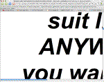 The
page is so wide that even when the window is
maximized to my decent-sized screen (1440 pixels),
it still can't be read without scrolling
horizontally. Why anyone would do that to their
potential customers is beyond me. The
page is so wide that even when the window is
maximized to my decent-sized screen (1440 pixels),
it still can't be read without scrolling
horizontally. Why anyone would do that to their
potential customers is beyond me.
But the next bit is not so
mysterious. It's not surprising that when people
exhibit fantastically poor judgement, they give you
other examples as well. Later on in the same
listing they use letters that are so large you can
read only one or two words at a time.
Imagine trying to read a book that had two words on
every page, and that provides a feel for how
obnoxious this is.
|
Browser stealing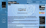
LegalFish.com
reviewed May 2008
Legal Fish lets you post your
legal problem so qualified attorneys can contact
you to offer their services. I posted my own
issue but never heard back from any attorneys, but
that's not why I listed this site. I listed it
because they sent me a survey that rudely resized
my browser window.
A couple weeks after I used
their site they emailed me a link to on online
survey asking about my experience. After I
completed the survey, for no good reason, the
site resized my browser window down to a tiny size
sufficient to display their thank-you page. Of
course this forced me to have to manually resize
the window back to its previous, larger size. I had
about ten other tabs open and I certainly didn't
want to browse those other tabs in a tiny 3"x3"
window.
I think that most visitors would
be annoyed with a site that lays claim to the
user's window, unceremoniously overriding whatever
size the user had already chosen for him/herself.
But even if only a minority of visitors object,
it's still wrong. What benefit is there in annoying
even 10% of your visitors? If you give any sizable
portion of your visitors a bad experience, that's a
problem.
Incidentally, this site also has
a useless, distracting, space-wasting Flash
animation on its home page. (More about problems
with Flash.) It's never surprising that a
website that ignores its visitors' interests in one
way does so in other ways, too.
|
|
Forms are completely
broken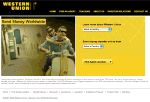
Western Union
reviewed May 2008
I spent over half an hour on
this site trying to do a simple money transfer. The
site fought me every step of the way, and in the
end I was forced to give up when I got a false
error message. After clicking a Continue
button, an error page said, "Your session has timed
out because of inactivity." But there was no
inactivity, I had been just then using the site. I
started over from the beginning, going through the
cumbersome process again of specifying all my
options, and got the same error. I tried another
browser, starting over from the beginning again,
but got the same error.
But that was just the final
problem, there were many others. The site won't
load unless you type in the WWW, unlike 99.999% of
all other sites on the net which load just fine
whether you type the WWW or not. When trying to
register, my password was rejected for being the
wrong length, even though it was within the limits
specified on the page. Once the password error
appeared, the "State" select box was empty, making
it impossible for me to select my state. Trying to
use the Back button to start over, I got an error
insisting that if I did that then a form would have
to be resent. I clicked OK and then the form was
erased, forcing me to start all over again. These
things were merely annoyances, but when the site
refused to let me continue because it erroneously
said my session had timed out, I had no way to
proceed. I used their competitor eMoneyGram.com
instead.
|
Hidden phone number,
Slow-loading Flash, Bait-and-Switch
Stratosphere Hotel-Casino
reviewed Feb. 2008
This hotel doesn't seem to
want your business very much. They don't bother
to put their phone number on their home page. In
fact, they don't even bother to put it on their
Contact page! There's more: when you go to
their site, you're treated to some slow-loading
Flash, and then if you click over to another page
and then hit the Back button, you get to wait for
the useless Flash to load again. We're not done
yet: The Specials & Packages page promises some
fantastic package deal if you sign up for their
Ultimate Rewards club, but if you actually do so,
once you're done there's zero info on how to claim
the package (or even how much it costs). Another
part of the site boasts about a "Lowest Rate
Guarantee", but if you click that link, you don't
get any info about any guarantee, all you get is
the booking form -- after waiting for the Flash to
load. (more...)
|
|
Splash / Flash combo
Tropical Smoothie
Café
reviewed Jan. 2008
This site tries really hard
to give the visitor a bad experience, and
succeeds. The first problem is the splash page
with the "Enter" button. Users don't want to have
to "Enter" a site; once they've arrived they expect
to already be there. Second, when you click Enter,
you get a pop-up window! Why on earth the
designers thought it would be a good idea to
clutter the user's screen, and break the Back
button in their browser, is beyond me. Third, the
site requires Flash. It doesn't just have a
Flash version, Flash is the only option.
Don't like Flash? Tough. You have no choice. You're
forced to use it anyway. And when you do, it's
painfully slow. After clicking the Enter button, it
took a full 40 seconds for the cumbersome
Flash page to load, even on broadband. Expecting
your visitors to patiently sit there for 40 seconds
while your page loads is the height of arrogance in
web design. Everything else about the site was
slow, too. Whenever I'd point to a button or click
it, my pointer would change to the spinning beach
ball, telling me I would have to wait.
(more...)
|
Site won't load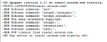
Wallace Twin City Realty
reviewed Jan. 2008
Websites are supposed to work
fine whether you type in the "www" or not. I've
always tried to teach web users that the "www" is
unnecessary, and there's no need to waste time by
typing it in. And that's true, for 99.999% of
websites out there.
But this particular site is an
exception. If you fail to type the "www", you'll
wait an inordinate amount of time for something to
happen, before finally getting an unhelpful cryptic
error message that says things like "OK Qpopper
(version 4.0) at rascal.soncom.com starting.
<98255.1200609396@rascal.soncom.com>".
|
|
User-hostile
navigation
Willits Bicycles
reviewed Dec. 2007
Regular readers know that one
little mistake won't get you listed on
ProblemWebsites. It takes either a huge
mistake, or a whole slew of smaller ones. But this
site is nearly a combination of those. Their front
page isn't actually the site (they force visitors
to "enter"), once entering they're forced to wait
through a pointless Flash load, once they get there
the address isn't listed, clicking on "Store"
spawns an annoying new window, that page has a note
that says that they're down for maintenance which
is two months old, and because of the Flash,
the email address isn't right-click copyable...
(more...)
|
Big Security
Vulnerability
Chase
reviewed Nov. 2007
Login pages at financial
institution websites are supposed to use a secure
protocol, to make it a lot harder for someone to
steal your login information and hack into your
account. Amazingly, the major banking site Chase
puts their login form on a completely insecure
page. What's more, they lie about
the problem, with a link to a "Ways we protect you"
page which (falsely) tries to reassure customers
that the site is actually secure. (more...)
|
|
Broken Registration
Process
Vegan Passions
reviewed Nov. 2007
There are no end of problems
with the registration process at this dating
site. In fact, it was so bad, after five
separate attempts I was unable to successfully
register. Problems include: Not informing the user
what happened after they press the Submit button,
automatically deleting accounts if the user lives
in a different city than their ISP, not informing
the visitor that their account was deleted, and
especially not informing them why it was
deleted. (more...)
|
No way to buy their
product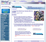
Hotel Interactive
reviewed Jan. 2, 2007
How can you sell something if
you don't give visitors a way to buy your
product? I found this page through a search
engine, which gives an abstract of the article, and
a login for members to read the whole thing. Well,
I just might want to become a member, but there's
no clue how to do so. There's no signup form on
this page, nor on the home page, nor on the login
page, nor anywhere else I clicked. The closest I
got was this
page which exclaims, "Subscribe to Hotel
Insider today!" It would be great if they gave you
a way to actually do so.
|
|
Insufficient
Information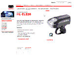
CatEye
reviewed Dec. 29, 2006
Prospective dealers of this
company's products will find that CatEye doesn't
care to provide enough information about its
products -- or even info on how to become a dealer
in the first place! (more...)
|
Orphaned Pages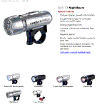
BBB Bike Parts
reviewed Dec. 29, 2006
This product page is attractive
enough, but where are the links? Why is there no
link for Contact, More Products, or even
Home?! The answer is that BBB used an
ancient, obsolete technology on their site:
frames. When you arrive at a product page (say
by searching for bbbparts
highwatt in Google), you arrive at the page
without the frames, and so all the menus are
missing. (more...)
|
|